
Our Branding Identity Design

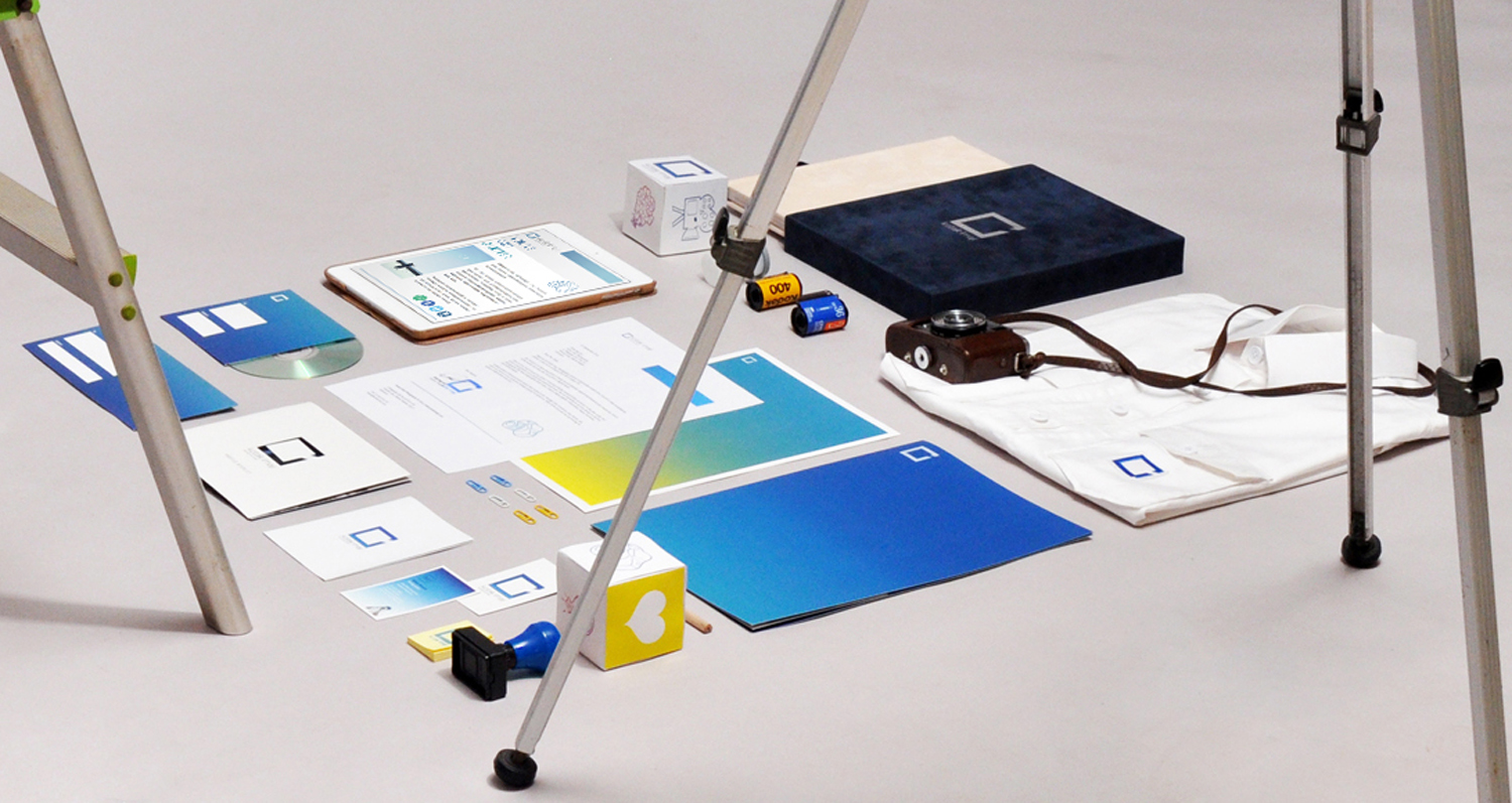
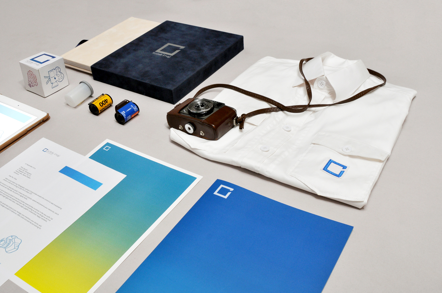
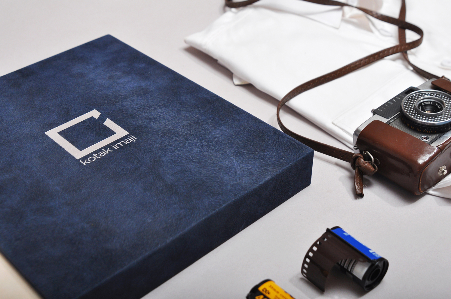
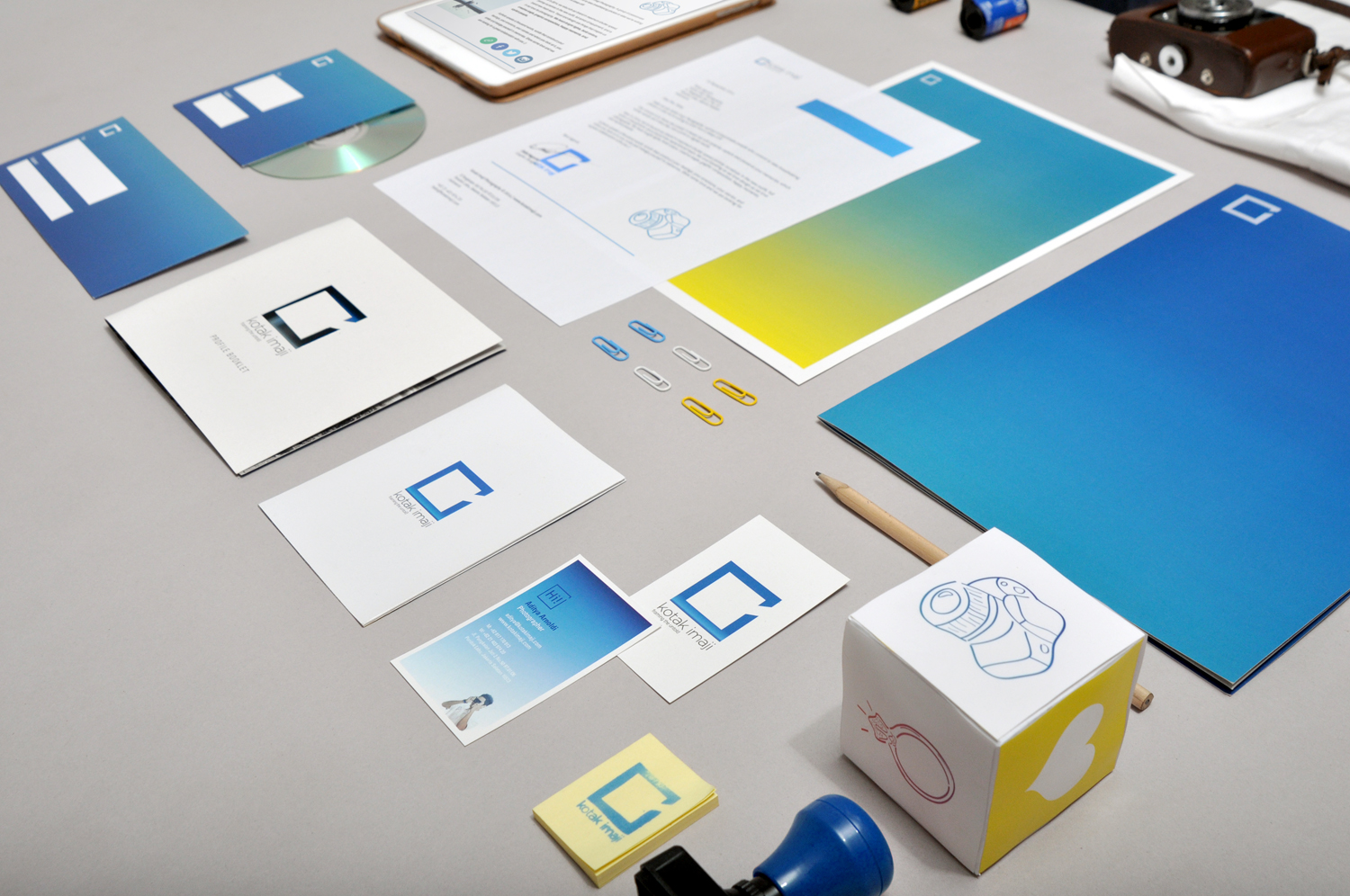
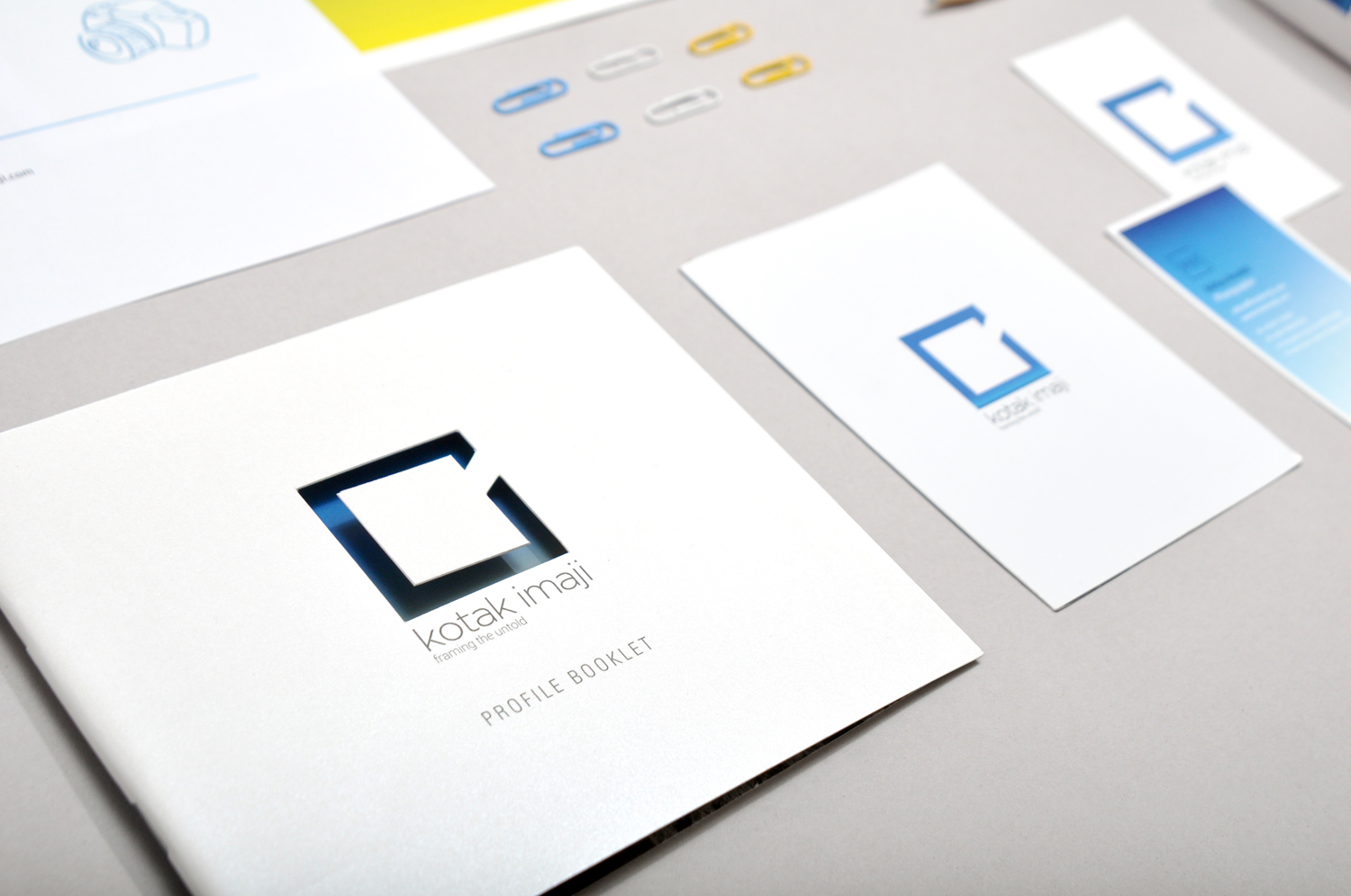
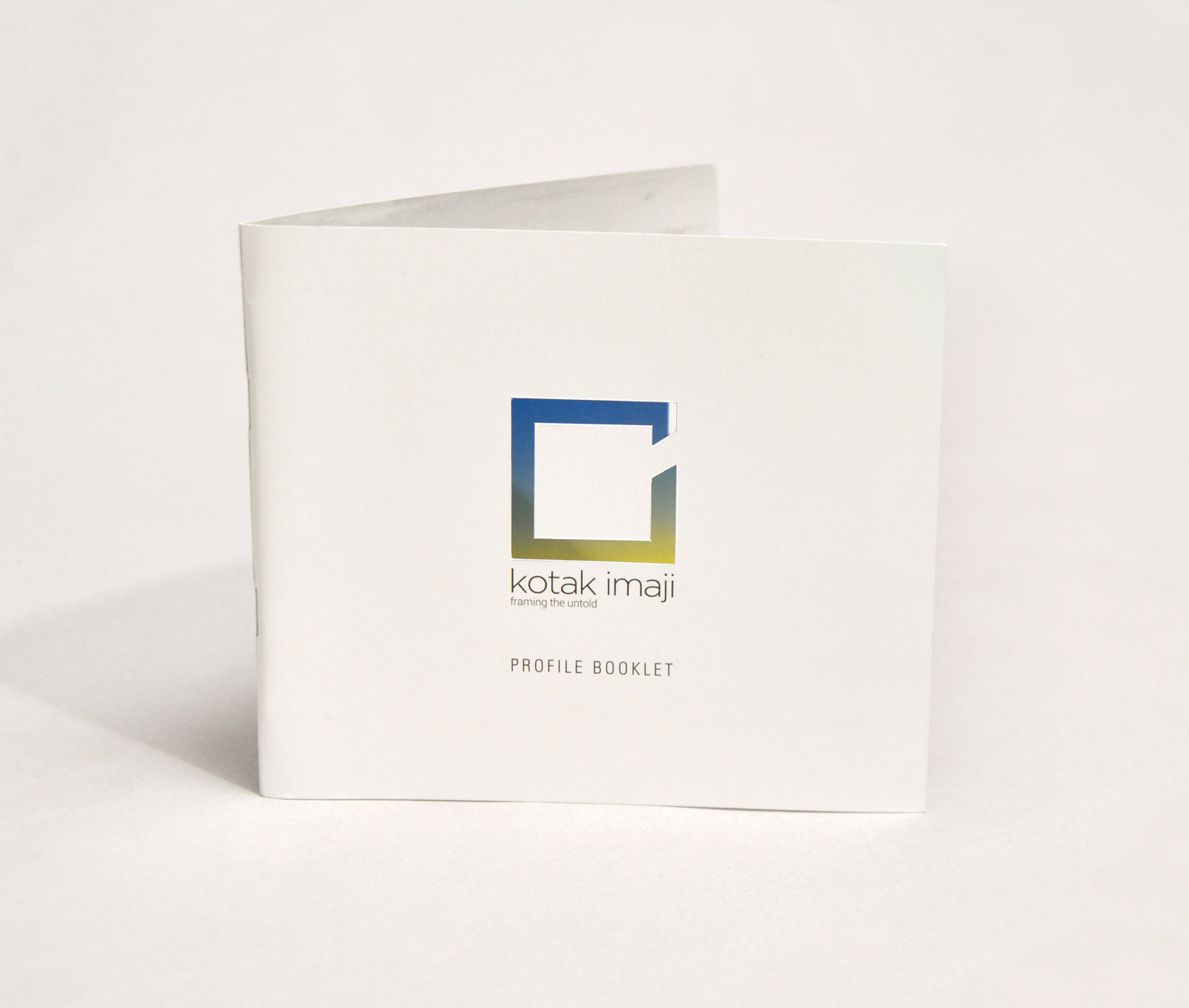
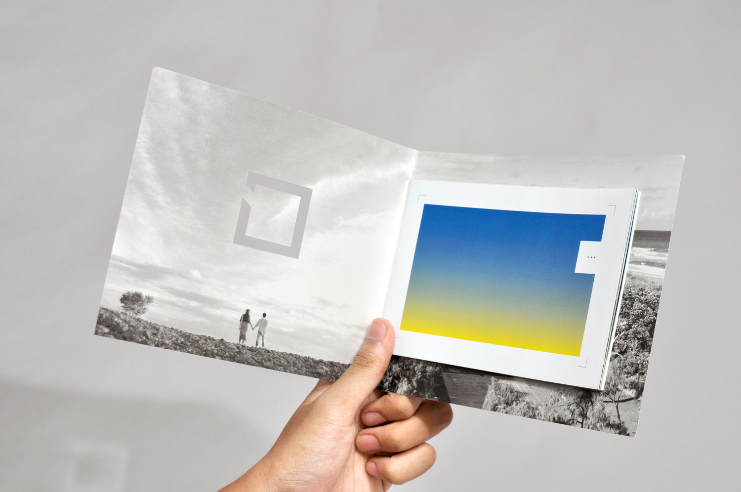
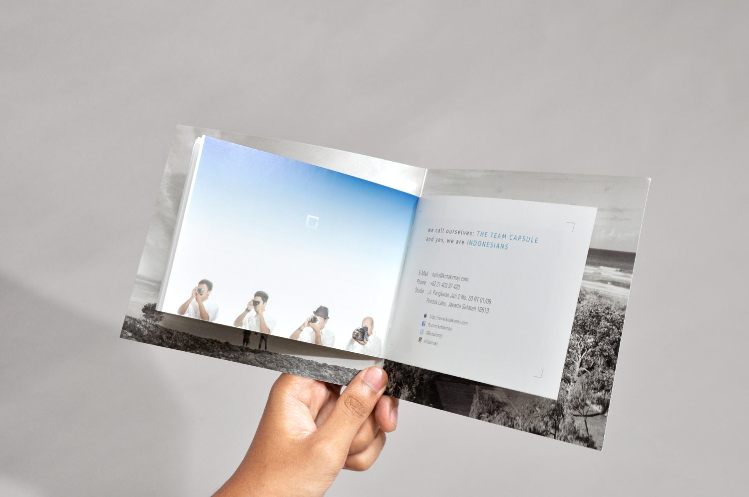
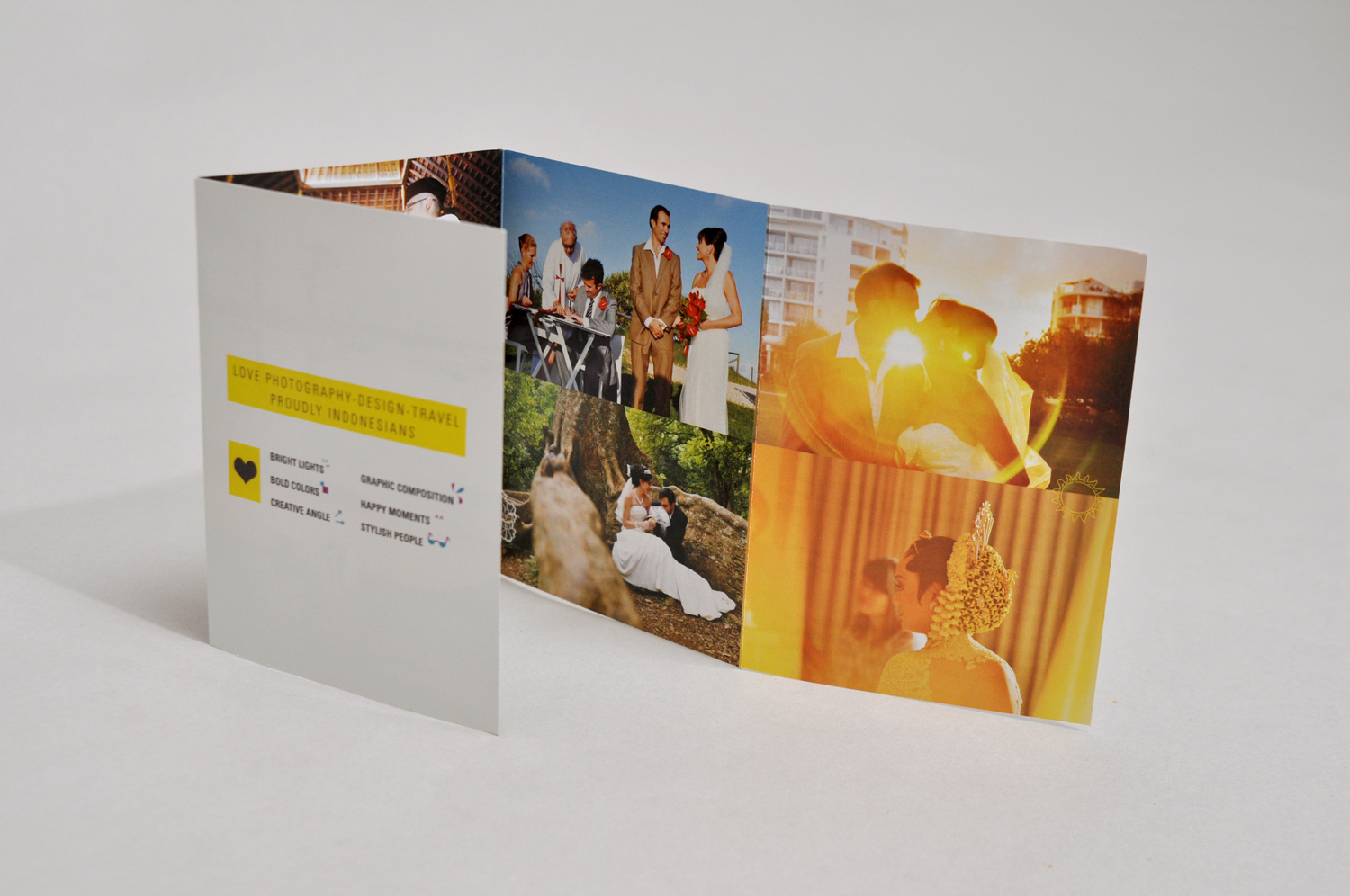
In 2014, we were rebranding our logo and corporate identity with the entry of a new partner, new equipments, new experienced team, and a new hope to start a new mission and vision. The logo concept represents a box or a place to explore our imagination and develop our creativity. This box can also symbolize the principle of camera that captures moments or images. We re-design our logo using golden ratio concept with the golden ruler system grid. The dominant colors that we used are shades of blue with gradation to a light blue or yellow and other shades of color, it matches the color of the sky and the sea because we want to represent colors of Indonesia's nature which is bright and sunny throughout the year. We are using graphic elements from hand-drawing that symbolize spontaneity and spirit of experimentation.
Traveling, Equipments, Essentials, Portrait, Event, Wedding, Pre-Wedding,
comments powered by Disqus


